Have you been asked to design a poster for an upcoming event? Or are you working to create a calendar, only to become frustrated with every redundant color, disorienting hue, and irrelevant shade? Getting a graphic design started can be a daunting task. Your key is to master these three bite-size techniques that make choosing a color palette successful yet not overwhelming.
When you create your color palette, seek to connect it in some manner to the theme of your poster. For example, if you already have an integral image in your design, you could choose from colors of the picture. Or, perhaps, if your poster is about nature, lean towards conventionally natural colors, like blues, greens, and browns. And as a general rule of thumb, unless you have a specific purpose, stay away from bright and neon shades as they can quickly shatter your audience’s interest by causing discomfort in their eyes. Such colors, especially when contrasting each other, often appear like they are vibrating and can be extremely jarring to the eye.
To thoroughly grasp this, take a look at this figure:

I know what you are thinking: green and red are opposites on the color wheel, right? They’re supposed to complement each other. That is not wrong, but contrasting these neon shades has a radically opposite effect.
Now, take a look at this:

Did you see what happened? The same colors were simply made less vibrant, and all of a sudden, the graphic became more pleasing.
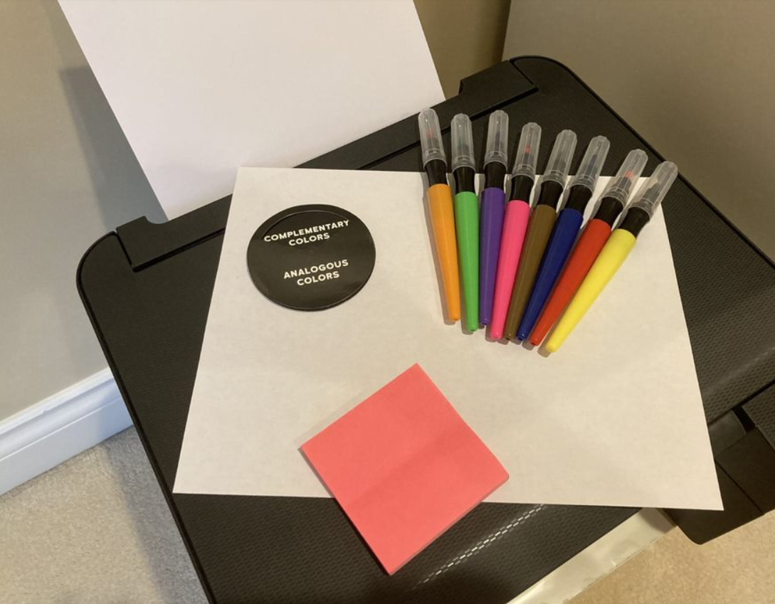
In addition, keep in mind that the number of colors utilized should ideally not exceed three, the maximum being five in certain circumstances. Typically, a design contains one primary color and two colors that complement it. These complementary shades could be more or less opposite, or proximal to the primary hue on the color wheel. They could even be a significantly lighter or darker version of the primary color.
That said, it is imperative to note that, even as a last resort, you should not ever juxtapose two colors that have closely alike but not identical hues. Please, don’t make your title light lavender and your subtitle lighter lavender. If you simply can’t find the same color again, make it a completely new shade, instead. Otherwise, the subtle variation is brazenly evident and can be extremely displeasing and disorienting to the eye of a viewer.
Each trudge involved in the climbing the mountain of graphic designing encompasses a lot of planning. And choosing a color scheme is no exception. But now that you have been introduced to the first step of this dynamic field, click open your graphic designing program. Browse the color options, and, keeping these general guidelines in mind, allow your creativity to flow freely!